

In the digital world, first impressions are formed in milliseconds. Before a user reads a single line of text or interacts with a single feature, they judge your product based on how it looks. This visceral reaction determines whether they stay and explore or bounce to a competitor. In an increasingly visual online ecosystem, relying on “gut feeling” for design is a recipe for failure. To captivate users and drive engagement, businesses need a deliberate, data-backed user interface strategy.
While User Experience (UX) focuses on how a product works, User Interface (UI) focuses on how it looks and feels. However, UI is not merely “decoration.” It is the bridge between the user and the code. A robust user interface strategy dictates the visual language that communicates your brand’s values, guides the user’s eye, and facilitates seamless interaction.
In this extensive guide, we will explore the nuances of developing a high-impact user interface strategy. We will cover everything from the psychology of color and typography to the technical implementation of design systems and accessibility standards. Whether you are launching a new app or rebranding a legacy website, this guide will serve as your roadmap.
Understanding the Core of a User Interface Strategy
To build an effective strategy, we must first define what a user interface strategy actually is. It is a comprehensive plan that aligns the visual elements of a product—layout, colors, typography, icons, and imagery—with the brand identity and user needs. It turns abstract business goals into tangible visual assets.
A user interface strategy goes beyond the “what” and addresses the “why.” Why are the buttons round instead of square? Why is the primary color blue? Without a strategy, these decisions are subjective. With a defined user interface strategy, every pixel has a purpose. It ensures that the interface is not only beautiful but also functional, consistent, and scalable.
Furthermore, a user interface strategy serves as a contract between designers and developers. It establishes the rules of engagement, reducing ambiguity during the handoff process. It ensures that the final coded product matches the design vision, maintaining integrity across different devices and screen sizes.
The Business Value of a Strong User Interface Strategy
Many stakeholders view UI design as a subjective art form, making it difficult to quantify. However, investing in a professional user interface strategy yields measurable business results.
1. Brand Recognition and Trust
Your interface is often the primary touchpoint for your brand. A consistent user interface strategy reinforces brand identity. When users see consistent colors, fonts, and imagery, it builds memory structures. If a financial app looks chaotic or amateurish, users will not trust it with their money. A polished user interface strategy signals professionalism, security, and attention to detail.
2. Reduced Cognitive Load
Cognitive load refers to the amount of mental effort required to use a product. A chaotic interface exhausts the user. A smart user interface strategy uses visual hierarchy to guide the user’s attention. By using size, color, and whitespace strategically, you tell the user what is important. This clarity reduces frustration and encourages users to stay longer on the platform.
3. improved Conversion Rates
Beauty sells. The “Aesthetic-Usability Effect” is a psychological phenomenon where users perceive more attractive designs as easier to use. A compelling user interface strategy can directly impact conversion rates. Clear, high-contrast Call-to-Action (CTA) buttons, legible typography, and engaging micro-interactions all contribute to a smoother funnel, guiding the user toward the purchase or signup.
The Relationship Between UX and User Interface Strategy
It is impossible to discuss UI without mentioning UX, but it is vital to understand where they differ. UX is the skeleton; UI is the skin. A user interface strategy cannot fix a broken user experience, but a poor UI can ruin a great UX.
Think of a house. The UX is the blueprint—where the doors and windows go. The user interface strategy is the interior design—the paint, the furniture, the lighting. You need both. A house with a great layout but peeling paint (poor UI) is unappealing. A house with beautiful furniture but no doors (poor UX) is unusable.
Your user interface strategy must work in harmony with the UX research. If UX testing reveals that users are older and have poor eyesight, your user interface strategy must prioritize high-contrast colors and large typography. If the target audience is Gen Z gamers, the strategy might lean towards dark mode and neon accents. The strategy translates user data into visual decisions.
Key Pillars of a Modern User Interface Strategy
Developing a comprehensive strategy requires attention to several foundational elements. Neglecting any of these can lead to a disjointed product.
1. Typography Hierarchy
Typography is 90% of the web. Your user interface strategy must define a clear typographic scale. This includes font families, weights, and line heights. But it’s not just about readability; it’s about tone. A serif font might convey tradition and authority, while a sans-serif font conveys modernity and cleanliness. The user interface strategy ensures that headings (H1, H2, H3) are visually distinct from body text, allowing users to scan content quickly.
2. Color Psychology and Palettes
Color evokes emotion. Blue creates trust; red creates urgency; orange creates energy. Your user interface strategy must define a primary, secondary, and neutral color palette. It should also define functional colors—green for success, red for errors, yellow for warnings. A rigorous user interface strategy also considers color blindness, ensuring that the interface is usable for the 8% of men who are color blind.
3. Iconography and Imagery
Icons are a universal language. They save screen space and speed up recognition. However, inconsistent icons can confuse users. Your user interface strategy should dictate the style of icons—are they outlined or filled? Rounded or sharp? Similarly, the strategy should define the style of photography or illustrations used. Stock photos that look generic can hurt credibility; custom, on-brand imagery elevates the interface.
4. Whitespace and Layout
Whitespace (or negative space) is not empty; it is an active design element. It allows the content to breathe. A cluttered interface feels overwhelming. A user interface strategy that prioritizes whitespace creates a sense of luxury and calm. It groups related elements together (The Gestalt Principle of Proximity) and separates unrelated ones, organizing the information logically for the user.
The Role of Design Systems in User Interface Strategy
As products grow, maintaining consistency becomes a nightmare. This is where a Design System comes into play. A Design System is a library of reusable components and standards. It is the operational heart of your user interface strategy.
Instead of designing a new button for every page, you pull a “Primary Button” component from the system. This ensures that every button has the exact same padding, border radius, and hover state. A user interface strategy that utilizes a design system accelerates development. Developers can copy-paste code snippets for these components, drastically reducing build time.
Furthermore, if you decide to change your brand color, you update it in the design system, and it cascades across the entire product. This scalability is why a design system is a non-negotiable part of an enterprise-level user interface strategy. It serves as the “single source of truth” for the entire organization.
Responsive Design and the Multi-Device User Interface Strategy
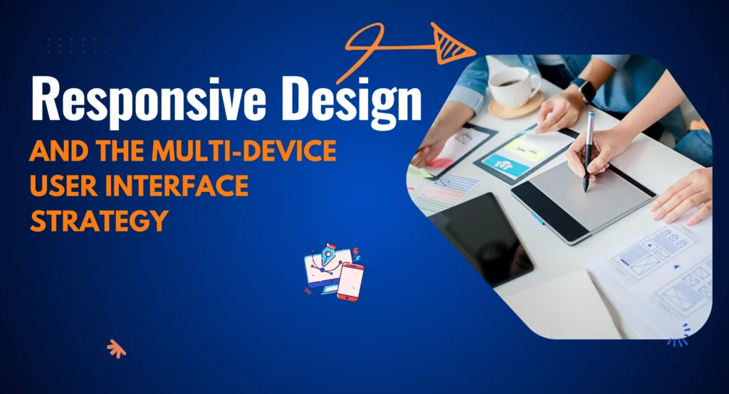
We live in a post-desktop era. Users access digital products on 4-inch phone screens, 10-inch tablets, and 27-inch monitors. Your user interface strategy must be responsive. This means the layout adapts fluidly to the screen size.
Mobile-First Approach
A modern user interface strategy often adopts a “Mobile-First” methodology. This involves designing for the smallest screen first. It forces designers to prioritize the most essential elements, removing clutter. When you scale up to desktop, you add complexity, rather than starting with a complex desktop site and trying to cram it onto a phone.
Touch Targets and Ergonomics
Designing for a mouse is different from designing for a finger. A mouse pixel-precise; a thumb is not. Your user interface strategy must account for “fat finger” errors. Buttons on mobile need to be at least 44×44 pixels. Navigation bars should be placed at the bottom of the screen for easy thumb access. These ergonomic considerations are vital for a successful mobile user interface strategy.
Interactivity and Motion in User Interface Strategy
Static interfaces are boring. Modern users expect feedback. This is where Interaction Design becomes part of your user interface strategy. When a user hovers over a card, does it lift? When they click “Submit,” does a spinner appear?
Micro-interactions
Micro-interactions are subtle animations that provide feedback. They acknowledge a user’s action. For example, the “heart” animation on Instagram is a micro-interaction. It delights the user. Including these moments of delight in your user interface strategy creates an emotional connection.
Transitions and Meaningful Motion
Motion should not be used just for the sake of it. It should have a purpose. Motion can guide the eye. If a menu slides in from the right, the user knows to swipe right to close it. Your user interface strategy should define the physics of these animations—the timing, the easing curves—to ensure the application feels snappy and performant, not sluggish.
Accessibility (a11y): An Ethical and Strategic Imperative
Excluding users with disabilities is not only unethical; it is bad for business and legally risky. A comprehensive user interface strategy treats accessibility as a core requirement, not an afterthought.
Contrast Ratios
The Web Content Accessibility Guidelines (WCAG) set specific standards for contrast. Your user interface strategy must ensure that text stands out against the background. Light gray text on a white background might look “sleek” to a designer, but it is unreadable for a senior citizen with reduced vision.
Visual Indicators
Never rely on color alone to convey information. If an error field turns red, a color-blind user might not see it. Your user interface strategy should mandate the use of icons or text labels alongside color changes to ensure the message is communicated to everyone.
Focus States
For users who navigate via keyboard (due to motor impairments), focus states are crucial. This is the outline that appears around a button when it is selected. Many designers remove this because they think it looks ugly. A responsible user interface strategy ensures these indicators are present and clearly visible.
The Psychology Behind User Interface Strategy
Great design is rooted in psychology. Understanding how the human brain processes visual information allows you to build a more effective user interface strategy.
Gestalt Principles
The human brain looks for patterns. Gestalt principles describe how we group visual elements.
- Proximity: Things close together are related.
- Similarity: Things that look alike perform the same function.
- Continuity: The eye follows lines and curves. Applying these principles in your user interface strategy helps you create layouts that are intuitive. The user doesn’t have to think about which label belongs to which input field; the proximity makes it obvious.
Hicks Law
Hick’s Law states that the time it takes to make a decision increases with the number and complexity of choices. A cluttered menu with 20 options paralyzes the user. Your user interface strategy should simplify choices. Break complex tasks into smaller steps. Use mega-menus to categorize options. By reducing the number of immediate choices, you speed up user decision-making.
Tools for Executing Your User Interface Strategy
To bring your strategy to life, you need the right stack. The days of designing websites in Photoshop are largely over.
- Figma: The current industry standard. It allows for real-time collaboration, making it ideal for teams executing a shared user interface strategy. Its “Auto Layout” feature mimics how code works, bridging the gap between design and development.
- Sketch: A powerful vector tool for Mac users, heavily used in the app design world.
- Adobe XD: Adobe’s solution for UI/UX, integrating well with the rest of the Creative Cloud.
- Storybook: A tool for developers to organize UI components. It is essential for maintaining the code side of your user interface strategy.
Choosing the right tools ensures that your workflow is efficient and that your user interface strategy is maintained consistently across the product lifecycle.
Dark Mode: A Modern Necessity
In 2026, Dark Mode is no longer a gimmick; it is a user expectation. Operating systems now have system-wide dark mode settings. If your app blasts the user with white light at night, they will uninstall it.
Your user interface strategy must include a “Dark Theme” variant. This is not as simple as inverting colors. Dark mode requires different contrast ratios and desaturated colors to prevent eye strain. Shadows don’t work in dark mode; you use elevation (lighter shades of gray) to show depth. A sophisticated user interface strategy plans for both light and dark environments from day one.
Measuring the Success of Your User Interface Strategy

How do you know if your visual design is working? While UI is qualitative, its impact is quantitative. You must track metrics to validate your user interface strategy.
A/B Testing
This involves showing two different versions of a UI to users to see which performs better. Does a red button get more clicks than a green one? Does a hero image with a person perform better than an abstract graphic? A/B testing provides hard data to refine your user interface strategy.
Heatmaps
Tools like Hotjar show where users are clicking and scrolling. If users are clicking on an element that isn’t a link, your user interface strategy has failed to communicate interactivity. If they are not scrolling down to your pricing table, your visual hierarchy needs adjustment.
Brand Sentiment Surveys
Ask users how they feel about the design. Key adjectives like “Trustworthy,” “Modern,” or “Easy” indicate a successful user interface strategy. If users describe the site as “Confusing” or “Dated,” it is time for a visual refresh.
Common Pitfalls in User Interface Strategy
Even experienced teams make mistakes. Here are common traps that can derail your strategy.
1. Inconsistency
This is the biggest killer. Different font sizes on different pages, slightly different shades of blue, inconsistent button styles—these erode trust. A rigorous user interface strategy enforces consistency through the Design System.
2. Form over Function
Dribbble is full of designs that look beautiful but are impossible to use. Low contrast text, tiny fonts, and experimental navigation might win awards, but they frustrate users. Your user interface strategy must always prioritize usability over artistic expression.
3. Ignoring Context
Designing in a vacuum is dangerous. A dashboard used by a stock trader in a high-stress environment needs a different user interface strategy than a meditation app used in a dark room. You must design for the user’s environment and emotional state.
Future Trends Shaping User Interface Strategy in 2026
The field of UI is constantly evolving. A forward-thinking user interface strategy anticipates these shifts.
3D and Immersive Elements
With the rise of WebGL and better browser performance, 3D elements are becoming common. They add depth and realism. A modern user interface strategy might incorporate 3D product renders that users can rotate, creating a more engaging shopping experience.
Voice User Interfaces (VUI) and AI
As AI becomes integrated into software, the interface becomes conversational. The user interface strategy of the future isn’t just about pixels; it’s about visualizers for voice commands and adaptive interfaces that change based on user behavior.
Neomorphism and Glassmorphism
Design trends cycle. We have seen a resurgence of “Glassmorphism” (frosted glass effects) and “Neomorphism” (soft, extruded shapes). While trends shouldn’t dictate your entire user interface strategy, incorporating modern stylistic elements keeps the brand looking current and relevant.
Executing the Handoff: From Strategy to Code
The most critical moment in the life of a user interface strategy is the developer handoff. Great design is useless if it cannot be coded.
Your strategy must include a “Redlining” process, where measurements and specs are clearly defined. Tools like Zeplin or Figma’s “Dev Mode” allow developers to inspect the code values of your design. Communication is key. Regular “syncs” between designers and developers ensure that the user interface strategy is feasible within the technical constraints of the project.
Documentation is the safety net. If a designer leaves the company, the user interface strategy should be documented well enough that a new designer can pick it up without missing a beat. This documentation is a tangible asset for the business.
Conclusion: The Strategic Advantage of Design
In conclusion, a ui strategy is not a luxury; it is a necessity for survival in the digital age. It transforms your digital product from a utility into an experience. It builds trust, guides behavior, and differentiates your brand in a crowded marketplace.
Developing this strategy requires a blend of creativity, psychology, and technical discipline. It requires you to look at your product through the eyes of your user. It demands consistency and a commitment to accessibility.
As technology evolves, your user interface strategy will need to adapt. It is a living document, not a static one. By continuously testing, measuring, and refining your visual language, you ensure that your product remains relevant and engaging.
Do not leave your visual identity to chance. Plan it. Structure it. Strategize it. When you treat UI as a strategic business asset, you unlock the full potential of your digital presence.
Ready to transform your digital experience?
Creating a visually stunning and strategically sound interface requires a team of experts. If you are ready to build a user interface strategy that captivates users and drives real growth, Rynox Digital is ready to partner with you. Let’s design the future of your business together.